.png)
Visual Breakdown Strategy: How to Explain Your Offer Clearly With Conversion-Focused Visuals
Table of Contents
- Introduction
- What a Visual Breakdown Strategy Is
- Why Prospects Get Confused by Text-Heavy Offers
- How to Build a Clear Offer and Funnel Visual
- Using Personalized Visuals in Outreach and Landing Pages
- Common Mistakes and Before-vs-After Examples
- Tools, Templates, and Workflow Tips
- Future Trends in Visual-First Offer Communication
- Conclusion
- FAQ
Introduction
Even the strongest offers will underperform if prospects cannot understand them within seconds. In today's saturated B2B landscape, buyers are overwhelmed by dense paragraphs, jargon-heavy pitches, and complex funnel descriptions. When clarity drops, friction rises, and potential conversions are lost simply because the prospect could not quickly grasp how your solution solves their problem. Clarity drives action, and visuals are the ultimate tool to reduce the friction that text-heavy messaging inevitably creates.
This article provides a practical framework you can use to explain complex services, intricate funnels, and nuanced value propositions across your outreach campaigns, landing pages, and sales demos. This is not a generic design tutorial or basic video advice. Instead, it is a repeatable visual breakdown strategy for translating confusing, abstract offers into simple, highly personalized visual sequences.
Designed for B2B marketers, sales teams, and founders who already have a validated offer but struggle to explain it clearly, this guide will help you learn how to explain your offer clearly and effectively. At RepliQ, our deep alignment with personalized visual communication and AI-supported image and video workflows has proven that when you combine strategic messaging with targeted visuals, comprehension and conversion rates soar. By mastering funnel explanation visuals, you ensure your buyers see exactly what they get, why it matters, and what to do next.
What a Visual Breakdown Strategy Is
A visual breakdown strategy is a deliberate framework for explanation, not just a creative asset. It is the systematic process of converting abstract, complex, or multi-layered messaging into a clear, step-by-step visual sequence that guides a prospect from their initial problem to your promised outcome.
This approach differs significantly from simply sharing a product demo, a static slide deck, an infographic, or an asynchronous video. In a visual breakdown strategy, the strategic messaging comes first, and the format is selected second to serve that message. Common use cases include embedding visual sequences in cold outreach messages, structuring landing pages, enhancing live demos, facilitating buyer education, and providing seamless funnel explanation. The most effective visual breakdowns reduce cognitive load by intentionally showing prospects only what they need to understand next, stripping away all non-essential information. By mastering visual sales messaging, you align your offer's presentation with how the human brain naturally processes information.
The Core Components of a Visual Breakdown
A successful visual breakdown relies on five foundational building blocks: the problem, the process, the proof, the outcome, and the next step. Each component must be visually distinct so the reader can scan the asset and understand the narrative instantly.
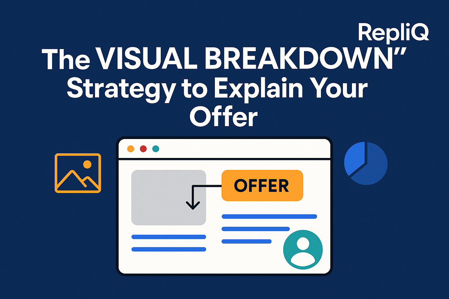
For example, if you are offering a B2B lead generation service, your visual breakdown should not be a dense block of text. Instead, it might feature a multi-panel visual: Panel 1 shows the problem (an empty CRM), Panel 2 shows the process (your proprietary scraping and outreach method), Panel 3 shows the proof (a screenshot of a high reply rate), and Panel 4 shows the outcome (booked meetings), ending with a clear CTA. The primary goal is comprehension first, aesthetics second. Value proposition clarity is achieved when a prospect can glance at your conversion-focused visuals and immediately understand the buyer journey explanation without reading a single paragraph.
When to Use Visuals Instead of Text-Only Explanations
Visuals drastically outperform text-only explanations when dealing with abstract services, multi-step funnels, unfamiliar offers, and cold outreach where attention spans are measured in milliseconds. While text-heavy copy forces the reader to mentally construct the process, annotated screenshots, diagrams, and short visual explainers do the heavy lifting for them.
Visuals are particularly critical at the top-of-the-funnel and during first-touch communications. In these stages, fast understanding is the only metric that matters. If a prospect is confused by your text pitch, they will simply delete the email or bounce from the page. This strategic approach to sales funnel visualization and landing page clarity goes far beyond using generic presentation tools; it is about engineering funnel explanation visuals that command attention and instantly answer the prospect's most pressing questions.
Why Prospects Get Confused by Text-Heavy Offers
Confusion in the buying journey usually stems from abstract wording, too many steps presented simultaneously, weak structural hierarchy, and an unclear connection between the prospect's problem and your proposed outcome. Text-heavy messaging creates massive friction in outreach, on landing pages, and during early buyer education because it demands too much mental energy from the reader.
When prospects are forced to decipher dense text, response rates plummet, engagement stalls, and conversion readiness drops to zero. As highlighted in the CDC clear communication guidelines, putting the main message first, chunking information into digestible pieces, and reducing cognitive overload are essential principles for effective communication. Text fails when it ignores these rules; visuals succeed by inherently enforcing them.
The Most Common Clarity Breakdowns
There are five core pain points where clarity breaks down: prospects do not quickly understand the offer, funnels feel too abstract, outreach lacks immediate context, service steps create information overload, and generic messaging fails to stand out from competitors.
In real marketing and sales materials, this often manifests as a massive gap between what the brand thinks it said and what the prospect actually sees. For instance, a brand might write: "We leverage synergistic omni-channel paradigms to optimize your revenue operations." The prospect sees: "Marketing jargon, delete." A visual breakdown rewrites this into plain structure: a simple flowchart showing a broken sales process turning into a streamlined, automated pipeline. Overcoming complex offer explanation hurdles requires prioritizing value proposition clarity so that outreach clarity is never compromised.
Why Visual Structure Improves Understanding
Diagrams, annotated screenshots, clear labels, and sequential visuals make complex relationships significantly easier to grasp than dense paragraphs. Visual hierarchy guides the prospect's eye to the most important information first, drastically reducing the time-to-understanding.
The right visuals support the main message rather than distract from it. They provide spatial context to abstract concepts, allowing the brain to process the "how" and "why" simultaneously. According to the NIH guide to clear and simple communication, simpler structure and one-message-at-a-time communication vastly improve comprehension. Visual storytelling for offers and visual sales messaging apply these principles directly to your sales funnel visualization, ensuring your prospects never have to guess what you mean.
How to Build a Clear Offer and Funnel Visual
Building a clear offer and funnel visual requires a repeatable process that translates confusing concepts into simple, easily digestible assets. The goal of this offer explanation framework is to map the buyer’s understanding, not just document your company’s internal operational processes. By applying this framework, you can deploy the best ways to visualize a sales funnel across your outreach emails, landing pages, and live demos.
Step 1 — Start With the Prospect’s Main Question
Before designing anything, identify the single most important question your visual must answer first: What is this? How does it work? or Why should I care? Simplify your offer into one core promise before adding any visual layers. Every extra message or secondary benefit weakens the visual if it competes with the main takeaway. Use headline-first thinking; write the exact takeaway you want the prospect to have, and then build the visual breakdown strategy around that singular value proposition clarity to learn how to explain your offer clearly.
Step 2 — Map the Offer From Problem to Outcome
Break your offer into 3 to 5 visual stages. Overwhelming readers with every minor detail of your process will kill conversions. A highly effective and basic sequence follows this path: problem → friction → solution → proof → next step. Your funnel explanation visuals must follow the buyer’s mental path, focusing on their journey rather than your business workflow. Add bold, simple labels to make each stage of the buyer journey explanation obvious at a mere glance, ensuring your sales funnel visualization is instantly readable.
Step 3 — Choose the Right Visual Format
Select a format that best fits the context of your communication. Common formats include annotated screenshots, simple diagrams, mini flowcharts, side-by-side comparisons, and short visual explainers. Annotated screenshots work brilliantly for outreach, while mini flowcharts might be better suited for buyer education. Do not choose a format just because it looks visually impressive; choose it because it clarifies the message. Personalized visuals will always outperform generic static assets when relevance matters. To scale this, leverage tools outlined in [INTERNAL_LINK: https://repliq.co/ai-images; https://repliq.co/blog] to integrate AI-supported visual workflows that make generating personalized outreach visuals and annotated screenshots for marketing effortless.
Step 4 — Add Context, Proof, and a Clear Next Action
A strong visual should never stop at mere explanation; it must actively guide the reader toward trust and action. Integrate proof elements directly into the visual layer, such as specific outcomes, social proof, or a mini-result metric. Use captions, callouts, and labels to bridge the gap between visual interest and actual decision-making. Finally, cap off your visual sales messaging with a practical CTA layer: tell them to book a demo, reply to the email, review the pricing page, or watch the full walkthrough. This is what separates pretty pictures from conversion-focused visuals.
Step 5 — Test for Clarity Before Publishing
Never publish without a clarity test. Can someone completely unfamiliar with your brand understand the offer in under five seconds without any supplementary text? Review the visual to ensure it answers the prospect’s likely objections without introducing new points of confusion. Test your visuals with teammates in different departments or, ideally, prospects outside the creation process. Clear visuals lead to measurable outcomes like better engagement, stronger reply intent, and landing page clarity. Following the NIST guidelines for clear instructions, ensure your outreach clarity is action-oriented and step-by-step.
Using Personalized Visuals in Outreach and Landing Pages
The visual breakdown strategy is highly adaptable across all acquisition channels and becomes exponentially more persuasive when tailored to specific contexts. The key differentiator here is that visuals should not be static design assets; they must be personalized to the audience, the specific prospect, or the exact funnel stage. Unlike tools that focus solely on format, a strategy-first approach ensures message relevance, deep personalization, and absolute clarity across every touchpoint.
Personalized Visuals for Cold Outreach
In cold outreach, you have seconds to capture attention. Annotated screenshots, custom video thumbnails, or prospect-specific mini visuals make your outreach instantly more relevant. Personalized outreach visuals quickly answer the prospect's internal questions of "why me?" and "why now?" far faster than generic text. For example, capturing a screenshot of a prospect's actual landing page, visually highlighting a conversion gap, and pointing an arrow to your proposed solution creates undeniable context. This level of visual sales messaging ensures your outreach clarity cuts through the noise, proving why generic outreach fails to stand out.
Visual Breakdown Strategy for Landing Pages
Landing pages frequently fail because they try to explain too much too early, or conversely, they hide the actual process behind vague, fluffy copy. To achieve true landing page clarity, use diagrams, distinct visual sections, and annotated product or service snapshots to make the buyer's journey effortless to follow. Align your landing page visuals with the exact sequence used in your cold outreach so the transition feels coherent and trustworthy. Incorporating a visual before-and-after clarity example immediately anchors the value of your offer. For guidance on layout hierarchy, the NIH formatting and visual clarity principles emphasize how proper visual support dictates user comprehension.
Using the Same Visual Logic in Demos and Buyer Education
Your live demos and asynchronous buyer education materials should mirror the exact same offer structure introduced in your outreach and landing pages. Do not introduce a completely new narrative or visual style on a sales call. Consistency across all channels reduces friction and shortens the path to understanding. Build one master visual framework—your core buyer journey explanation—and adapt its depth and detail level based on the context. This creates a unified loop of visual storytelling for offers that keeps conversion-focused visuals aligned from first touch to closed won.
Common Mistakes and Before-vs-After Examples
Recognizing what weak visual explanation looks like is just as important as knowing how to build a strong one. Many brands mistake "adding images" for a visual breakdown strategy. To truly improve conversion rates, your visuals must be highly intentional.
Mistake 1 — Showing Too Much at Once
Cluttered visuals and over-detailed funnel maps increase confusion instead of reducing it. When prospects see a diagram with twenty arrows and blocks of tiny text, they experience immediate cognitive overload. The better alternative is strict discipline: one message per panel, one action per step, and one core takeaway per visual. For example, instead of a massive, tangled flowchart of your entire software ecosystem, present a simple 3-step sequence showing data going in, the AI processing it, and the clean report coming out. This eliminates text-heavy messaging confusion and sharpens your funnel explanation visuals.
Mistake 2 — Focusing on Features Instead of the Buyer’s Path
Many companies design visuals that perfectly mirror their internal operational processes but completely ignore the prospect’s decision flow. Reframing the visual around the problem, the friction, the outcome, and the proof makes the asset infinitely more persuasive. In a before-and-after scenario, an ineffective visual might list "API Integration, Webhooks, and Cloud Sync." The improved buyer journey explanation visual would instead show "Your messy data" → "Automated Sync" → "Ready-to-use insights." This shift is how to simplify a complex offer for prospects and ensure total value proposition clarity.
Mistake 3 — Using Generic Visuals With No Context
Stock diagrams, generic icons, or unedited screenshots fail to create relevance in outreach and sales messaging. Prospects have learned to ignore generic stock art. Even a light layer of personalization can drastically improve clarity and attention. Adding prospect-specific annotations, using recognizable industry examples, or including funnel-specific callouts transforms a boring image into a highly relevant pitch. Personalized outreach visuals ensure your message resonates, whereas generic outreach fails to stand out and destroys outreach clarity.
Mistake 4 — No Clear CTA or Next Step
A visual can be perfectly understandable but still entirely ineffective if it does not guide the prospect toward action. Never leave the buyer wondering what to do next. Pair your visual with a simple, direct next step based on the channel and stage. Examples include "Reply to this message to see your custom setup," "View the pricing page," or "Book a 10-minute walkthrough." According to CDC visual communication resources, visuals must reinforce action and meaning with clear labels and headings. An offer explanation framework is only complete when it drives conversion-focused visuals toward a definitive close.
Tools, Templates, and Workflow Tips
Implementing a visual breakdown strategy does not require reinventing your tech stack. Tools are merely enablers of the strategy, not substitutes for it. Many teams already possess powerful design or video tools but still fail to communicate clearly because they lack a repeatable framework. By leveraging AI-assisted visual creation, you can rapidly speed up personalization and iteration without getting bogged down in manual design work.
A Simple Reusable Template for Visual Breakdowns
To scale your efforts, adopt a repeatable, swipeable structure that you can adapt to any offer, funnel, or outreach campaign. A highly effective template includes:
- Headline: The core promise (e.g., "How we automate your lead generation").
- Problem Snapshot: A visual of the current painful state.
- 3-Step Explanation: Simple visual blocks showing the transition.
- Proof: A micro-metric or client logo embedded in the visual.
- CTA: The immediate next step.
Whether you use static images or dynamic personalized videos, this visual breakdown strategy ensures you always know how to explain your offer clearly, providing excellent sales funnel visualization examples for your team to follow.
Workflow Tips for Faster Creation and Iteration
Efficiency is key. Create one core, high-level visual and repurpose it into bite-sized outreach snippets, detailed landing page modules, and comprehensive demo slides. Review which elements of the visual can be personalized by industry segment, company size, or specific use case. Always test message clarity before spending hours polishing the graphic design. This strategic workflow is vastly superior to manual, design-heavy approaches that bottleneck your sales campaigns. For seamless execution, explore how [INTERNAL_LINK: https://repliq.co/ai-images; https://repliq.co/blog] can automate and scale your personalized outreach visuals, ensuring your conversion-focused visuals are generated swiftly and accurately.
Future Trends in Visual-First Offer Communication
The B2B buying landscape is shifting rapidly toward self-serve, remote buying journeys. As buyers prefer to conduct independent research, the demand for faster, clearer self-serve understanding has never been higher. This strategy matters now more than ever as the market moves away from generic visual assets toward contextual, highly personalized explanations.
From Static Assets to Personalized Visual Systems
Visuals are evolving from one-size-fits-all presentations into dynamic, adaptable assets tied directly to the audience's context. A static PDF is no longer enough. Modern buyers expect personalized visual systems that address their specific pain points in real-time. This creates a massive competitive advantage in outreach and education. By applying the visual breakdown strategy, you transform static images into personalized outreach visuals that drive immediate outreach clarity.
Why Strategy Will Matter More Than Format
While tools for creating video, design, and diagrams are widely accessible, the true differentiator is having a repeatable explanation system. The market is flooded with solutions that emphasize flashy formats over actual communication strategy. A beautiful video that fails to explain the offer is useless. Strategy will always trump format. By focusing on an offer explanation framework that prioritizes value proposition clarity and visual sales messaging, your brand will consistently out-convert competitors who rely solely on aesthetics.
Conclusion
If prospects do not understand your offer quickly, your funnel loses momentum long before a conversion can even happen. Clarity is the ultimate currency in modern sales and marketing. The visual breakdown strategy provides a foolproof framework: identify the core question, map the offer from problem to outcome, choose the right format, inject proof and a CTA, and rigorously test for clarity.
Visual breakdowns work best when they are highly personalized and applied consistently across your cold outreach, landing pages, and live demos. Do not let text-heavy confusion kill your pipeline. Review one confusing part of your current funnel today and transform it into a simple, high-converting visual breakdown. With RepliQ’s tested visual explanation approach and practical expertise in AI-driven personalized visual workflows, you have the exact blueprint needed to turn complex offers into undeniable, instantly understood value.
FAQ
What is a visual breakdown strategy for explaining an offer?
A visual breakdown strategy is a repeatable, structured method for turning a complex or abstract offer into a simple, step-by-step visual sequence. It strips away text-heavy jargon and focuses on what is a visual breakdown strategy for explaining an offer by guiding the prospect visually from their problem to your solution, making the offer instantly easier to understand and act on.
How do visuals improve funnel explanation clarity?
Visuals drastically reduce cognitive load by showing the direct relationships between steps rather than forcing the prospect to read and imagine them. When asking how do visuals improve funnel explanation clarity, the answer lies in their ability to make abstract processes concrete, ensuring sales funnel visualization is effortless to follow.
What visuals work best for explaining a product or service offer?
The most effective formats depend on the context, but generally, annotated screenshots, process diagrams, before-and-after comparisons, and short visual explainers yield the best results. If you are wondering what visuals should be used to explain a product or service offer, annotated screenshots for marketing are particularly powerful for cold outreach.
How detailed should a funnel explanation visual be?
It should be as simple as possible while still answering the prospect’s immediate next question. The best ways to visualize a sales funnel involve stripping away non-essential operational details and using 3 to 5 clear stages. Funnel explanation visuals should focus entirely on the buyer's journey, not the vendor's internal complexities.
Can personalized visuals improve cold outreach performance?
Yes, personalized visuals significantly improve cold outreach performance by instantly demonstrating relevance. When a prospect sees their own website or data in your visual, they immediately understand why the message matters to them. Can personalized visuals improve cold outreach performance? Absolutely—personalized outreach visuals drive higher reply rates by replacing generic pitches with undeniable, tailored clarity.

.svg)
.png)


.svg)


