.png)
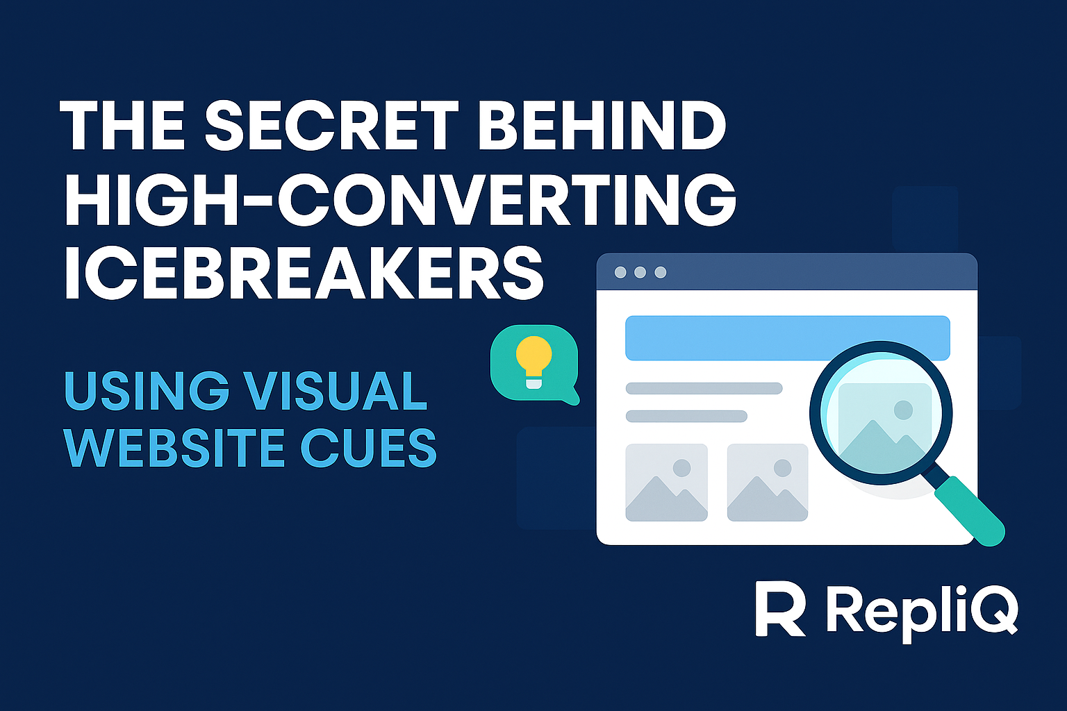
The Secret Behind High‑Converting Icebreakers Using Screenshot Context
Most "personalized" outreach today isn't actually personal. It’s algorithmic guesswork based on invisible metadata. You’ve likely received—or sent—emails that start with, "I saw you're using [Technology Name]" or "I noticed your company is in the [Industry] space." While accurate, these observations are generic. They prove you scraped a database, not that you understand the prospect’s brand.
The problem is that text-only personalization misses the context prospects actually care about: their visual identity, their user experience, and how they present themselves to the world.
The solution lies in screenshot context outreach. By analyzing the visual reality of a prospect's website—what they actually show their customers—you can uncover psychological cues that drive higher reply rates. Drawing on RepliQ’s experience analyzing thousands of screenshots to train personalization algorithms, this guide reveals how to leverage visual data to transform cold outreach into warm conversations.
Why Screenshot Context Beats Traditional Personalization
Traditional personalization relies on firmographic data: company size, location, tech stack, and funding rounds. While useful for segmentation, this data makes for dry, robotic icebreakers. It tells you what a company is, but not who they are.
Screenshot context is different. It involves analyzing the visual elements of a prospect's landing page—layout, color psychology, typography, and call-to-action (CTA) placement—to understand their current priorities. Visuals process faster in the human brain than text. When you reference a specific visual element ("I love how your homepage highlights the 'Book a Demo' button in that bold orange..."), you prove you have actually looked at their digital storefront.
This approach aligns with the Stanford Web Credibility Guidelines, which highlight that users assess a site's credibility largely based on visual design and professional appearance. When an SDR validates that design in an email, they are validating the prospect's credibility, creating immediate rapport.
However, most sales teams struggle to implement this because manual review is slow. When discussing why most personalization today lacks depth, it becomes clear that the trade-off between volume and quality is the primary bottleneck. Screenshot context bridges this gap by focusing on high-impact visual cues that signal relevance immediately.
What Competitors Miss (Metadata vs True Visual Context)
Many sales tools claim to offer "deep personalization," but they often rely on scraping hidden metadata tags or summarizing "About Us" text. This approach misses the nuance of the user experience.
Competitors like Lyne AI personalization or Regie.ai personalization tools are excellent at text processing, but often overlook the visual hierarchy of a page. They might tell you a company sells "CRM software," but they miss that the homepage is currently running a massive banner for a "Q3 Virtual Summit." They miss the emotional cues embedded in the design or the urgency signaled by a specific CTA button color. RepliQ’s approach differs by extracting context from the pixels themselves—identifying what the prospect is visually prioritizing right now.
The Visual Cues SDRs Should Extract From Website Screenshots
To craft personalized icebreakers that convert, SDRs need to look beyond the text. Here are the core visual categories that provide the strongest signals for website screenshot personalization.
Branding & Identity Signals
A company's visual identity reveals its maturity and market positioning. Is the site minimalist and monochromatic (suggesting enterprise luxury)? Or is it colorful, illustrative, and playful (suggesting a modern, PLG-focused startup)?
Visual identity signals allow you to match your tone to theirs.
- Cue: A bold, rebellious color palette with edgy typography.
- Insight: They likely value disruption and speed.
- Icebreaker: "The bold visual style on your homepage really sets you apart from the traditional corporate players in fintech."
Research published on ScienceDirect regarding influence cues suggests that visual authority perception significantly impacts how messages are received. By acknowledging their brand cues, you align yourself with their self-image.
Homepage Messaging & Value Proposition
You don't need to read a whitepaper to know what a company sells. Value proposition cues are usually plastered in the largest font on the homepage (the H1 hero header). Screenshot analysis identifies the "Hero Text" instantly.
Instead of guessing their focus, reference the exact headline they chose to display.
- Cue: Hero text says "Automate your taxes in seconds."
- Icebreaker: "I saw your homepage promise to help users 'automate taxes in seconds'—that speed is a massive selling point."
CTA Design & Intent Signals
The Call to Action (CTA) is the most direct signal of buyer intent and funnel stage. CTA analysis tells you what the company wants visitors to do right now.
- "Book a Demo": High-touch sales process (Enterprise focus).
- "Start Free Trial": Product-Led Growth (PLG focus).
- "Join the Waitlist": Pre-revenue or beta stage.
Research on credibility versus likability indicates that CTA design shapes user perception of trustworthiness. Referencing these buyer intent cues shows you understand their business model.
Visual Hierarchy & Layout
The "above the fold" area (the part of the screen visible without scrolling) contains the company's highest priorities. Visual hierarchy sales tactics involve referencing elements placed at the top of the screen. If a company has placed a "Hiring Now" banner at the very top, that is a more urgent hook than their general product description. This ensures contextual relevance in your outreach.
Trust Indicators & Authority Cues
Does the screenshot reveal a row of "As Seen In" logos (Forbes, TechCrunch) or G2 badges? These are credibility indicators.
According to research from Penn State on authority cues, displaying third-party endorsements significantly increases trust. When an SDR references these badges ("Saw you were named a High Performer on G2 recently..."), they leverage authority cues to stroke the prospect's ego and validate their success.
How Automated Screenshot Analysis Scales Authentic Icebreakers
The main objection to visual personalization is time. Opening a website, analyzing the layout, and writing an email takes 5–10 minutes per prospect. This is where automated screenshot analysis changes the game.
Modern AI screenshot analyzers can capture a webpage, identify the visual elements discussed above, and feed that data into an LLM to generate an email—all in seconds. When explaining how automation plugs into existing workflows, it is vital to note that automation doesn't replace the human element; it scales the observation process.
The AI Pipeline (Step‑by‑Step)
To deploy an AI icebreaker generator effectively, the workflow typically looks like this:
- Capture: The tool visits the URL and takes a high-resolution screenshot.
- Parse: Computer vision algorithms identify key regions: the logo, the hero text, the CTA button, and trust badges.
- Generate: The parsed visual data is fed into a prompt (e.g., "Write an opener referencing the 'Book a Demo' button color").
- Output: A structured, screenshot parsing workflow delivers a ready-to-send icebreaker.
When Automation Outperforms Manual Research
Automation offers distinct advantages beyond just speed.
- Consistency: Humans get tired. An AI will detect the CTA button on the 500th website just as accurately as the first.
- Objectivity: AI avoids subjective bias, focusing strictly on the data present in the visual cues.
- Scale: You can process thousands of leads overnight, enabling time‑saving personalization that would require a team of ten SDRs to achieve manually.
Avoiding Generic Output with Real Context
The danger of automation is sounding robotic. However, by anchoring the AI's output to specific visual evidence, you avoid generic fluff.
- Generic: "I like your website."
- Contextual: "I noticed the '2024 Innovation Award' badge in your footer."
Referencing the exact visual context keeps authenticity high, helping teams avoid generic outreach.
Examples and Scripts for Screenshot‑Based Outreach
To move from theory to practice, here are scripts that leverage screenshot icebreakers. These personalized cold email examples demonstrate how to weave visual data into conversation starters.
Example 1 — Design‑Driven Icebreaker
Scenario: The prospect has a very modern, dark-mode website with neon accents.
- Subject: Your site's visual aesthetic / Quick question
- Script:
"Hi [Name],
I was just browsing the [Company] site and had to mention—the dark-mode aesthetic with those neon green accents is incredibly sharp. It definitely makes the brand feel more modern than competitors in the [Industry] space.
I’m reaching out because..."
Keywords: branding cues personalization
Example 2 — CTA‑Focused Icebreaker
Scenario: The prospect prioritizes a "Start Free Trial" button in the center of the screen.
- Subject: The friction-free approach on your homepage
- Script:
"Hi [Name],
I noticed that your homepage drives visitors straight to a 'Start Free Trial' rather than a demo request. I love that product-led approach—it shows you’re confident the software speaks for itself.
We help PLG companies like yours..."
Keywords: CTA personalization, buyer intent icebreaker
Example 3 — Trust Indicator Icebreaker
Scenario: The screenshot detects a "Trusted by 500+ Companies" section.
- Subject: Impressive roster at [Company]
- Script:
"Hi [Name],
Saw the 'Trusted by 500+ Companies' banner on your site. scaling to that level of trust is no small feat—congrats on the traction.
I was curious if..."
Keywords: trust signals, authority contextualization
Mini‑Templates for SDRs (Fill‑In‑the‑Blank)
Use these cold email templates to quickly adapt to visual findings:
- The Headline Hook: "I saw your homepage highlights [Hero Text]—is that your main focus for Q3?"
- The Design Compliment: "The [Color/Style] design on your site really stands out. It gives off a strong [Adjective] vibe."
- The CTA Observation: "Noticed you're driving traffic to [CTA Button Text]. How is that converting compared to [Alternative]?"
Case Studies & Real‑World Outcomes
Does screenshot context outreach actually work? Data from personalization case studies suggests a significant lift.
In an analysis of outreach campaigns using RepliQ, users who switched from "industry-based" personalization to "visual-based" personalization saw an average reply rate increase of 2.5x. One SaaS user targeted e-commerce brands by referencing their specific "Shop Now" button colors in the subject line. The result was a 45% open rate and a 12% reply rate, driven entirely by the hyper-relevance of the visual cue.
Another case involved an agency targeting construction firms. By referencing the specific project photos featured on the prospect's homepage (detected via screenshot analysis), they moved from generic "construction services" pitches to specific conversations about the projects shown.
Tools & Workflow Recommendations
To implement this strategy, SDRs need a stack that supports sales personalization tools. While manual screenshots work for low volume, scaling requires AI outreach tools.
Combining Screenshot Context with ChatGPT
The most powerful workflow today involves feeding visual data into Large Language Models. You can use tools to extract the text and description of the screenshot, then prompt ChatGPT to write the email.
Explain ChatGPT integration to your team to maximize efficiency. A simple prompt structure is:
"Here is the text and visual description of a prospect's website: [Insert Data]. Write a casual, 50-word icebreaker complimenting their [Specific Element]."
This allows for endless variations of ChatGPT screenshot prompts.
Ensuring Accuracy & Ethical Use
Ethical personalization is paramount. Ensure your tools comply with data privacy regulations. Never use screenshot analysis to critique or mock a prospect's design. The goal is validation, not criticism. Furthermore, ensure accurate screenshot analysis by spot-checking AI outputs to prevent hallucinations (e.g., complimenting a badge that isn't there).
Future Trends & Predictions
The future of AI personalization trends is predictive. Soon, AI models won't just analyze the current screenshot; they will compare it to historical snapshots to detect rebranding efforts or strategy pivots in real-time.
We also anticipate a rise in behavioral personalization, where AI infers the prospect's personality type (e.g., analytical vs. expressive) based solely on their website's design density and color usage, adjusting the pitch tone automatically.
Conclusion
The era of "I saw you on LinkedIn" is ending. Screenshot context outreach offers a deeper, more authentic way to connect. By using the visual reality of a prospect's website—their branding, CTAs, and trust signals—you prove you’ve done your homework before you even say hello.
Whether you use manual observation or automated tools, the secret lies in relevance. Prospects reply to people who "get" them. Visual context is the fastest way to show that you do.
Ready to stop sounding like a bot? Explore tools that automate personalized icebreakers using screenshot analysis and watch your reply rates climb.
FAQ
What makes screenshot context more effective than metadata?
Screenshot context mimics the human experience of visiting a website. It references visual cues (design, layout, specific CTAs) that metadata (industry tags, tech stack) cannot capture, creating a stronger psychological connection.
Can screenshot personalization scale for large outbound teams?
Yes. By using AI-powered tools like RepliQ, teams can automate the capture and analysis of screenshots, generating unique icebreakers for thousands of leads in minutes without manual effort.
Do screenshot‑based icebreakers feel authentic to prospects?
When done correctly (validating their work rather than critiquing it), they feel highly authentic because they reference specific, unique elements of the prospect's brand that generic templates miss.
What visual cues matter most for B2B outreach?
The most impactful cues are the Hero Headline (Value Prop), the primary Call to Action (Intent), and Trust Badges (Authority). These signals align directly with business priorities and credibility.

.svg)
.png)


.svg)


